
Brand & Market Alignment
The packaging concept was developed to position PRIMAL as a premium, performance-driven protein line with strong shelf impact and fast readability.
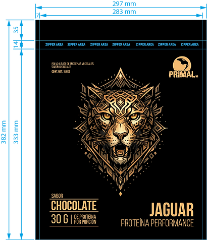
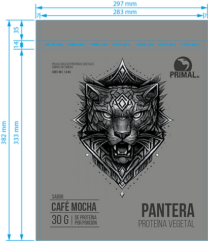
The system reinforces brand values of strength, clarity, and consistency by using a bold animal hero illustration paired with a clean information hierarchy.
For e-commerce and retail, the front panel prioritizes quick scanning of flavor, protein per serving, and product type, while maintaining a cohesive look across variants.

Structural Concept & Inspiration
The structural approach focused on a stand-up pouch format that supports product protection, easy handling, and reliable shelf stability.
The pouch geometry and front-panel layout were designed to stay legible on a flexible surface, ensuring the artwork and typography remain clear even with natural folds and curvature.
The concept also considers scalability for multiple SKUs, allowing new flavors and lines to plug into the same structure without redesigning the full system.


Functional Features
Resealable Zip Closure
As part of the final production packaging, the stand-up pouch includes a resealable zip closure that helps protect the product after opening and improves everyday usability. This closure supports freshness retention and reduces the risk of spills during handling and storage.
Durable Stand-Up Pouch Structure
The pouch structure was engineered for stable shelf presentation and reliable handling. The reinforced base allows the package to stand consistently, improving retail appearance and helping maintain a clean front-facing display across multiple units.
Fast Front-of-Pack Readability
The front panel is designed for quick scanning in both retail and e-commerce. Key information is prioritized and grouped to make flavor identification, protein per serving, and product type immediately clear, reducing shopper friction and improving product selection speed.
Graphic Design
As the graphic and packaging designer on the project, I developed the full visual system and production-ready artwork for the pouches. This included:
-
A strong hero illustration to create instant brand recognition
-
A consistent typographic hierarchy for product name, flavor, and key nutrition callouts
-
Print-ready files prepared with safe zones, clearances, and production constraints in mind
-
A layout system built to scale across multiple flavors/SKUs while maintaining consistency
-
Final artwork and labeling aligned to real packaging requirements for retail and e-commerce
-
The result is a production pouch system that balances premium shelf impact, clear communication, and functional packaging performance.


Project Outcomes
The final stand-up pouches delivered a stronger shelf presence and clearer product communication across flavors. The consistent front-of-pack hierarchy improved quick scanning for flavor and key nutrition callouts, while the finished packaging supported retail presentation and e-commerce imagery with a premium, cohesive look.
My Role
I led the packaging design development from end to end, combining brand integration, production-ready artwork, and realistic mockups aligned with final manufacturing constraints. This included building a scalable layout system for multiple SKUs, preparing print-ready files with safe zones and tolerances, and ensuring consistency across variants.
Impact & Learnings
This project reinforced the importance of balancing brand storytelling with real packaging performance. It strengthened my ability to design systems that scale across SKUs, maintain legibility on flexible materials, and translate cleanly from design to production for both retail and digital channels.