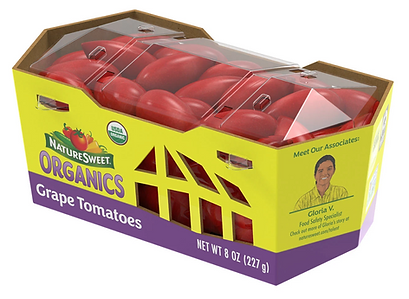
NatureSweet Organics 8 oz Packaging Design
As the Packaging Engineer and Graphic Designer for this project, I led the design, development, and implementation of the 8 oz packaging for NatureSweet’s new line of organic grape tomatoes, distributed across the United States through Walmart.
The objective was to create packaging that communicated organic freshness, sustainability, and brand identity, while also improving functionality throughout the entire supply chain.


Brand & Market Alignment
The concept was developed in response to market demand for organic produce presented in packaging that reflects transparency, environmental responsibility, and strong shelf appeal.
The final design uses Recycled PET for the lid and micro-corrugated cardboard for the base, offering durability, sustainability, and optimal protection during transport and retail handling.
Structural Concept & Inspiration
The structural design was inspired by the greenhouses where NatureSweet tomatoes are grown.
The signature cut-outs on the sides mimic the greenhouse silhouette — a visual element that strengthens brand identity while also serving as ventilation slots that improve airflow and extend shelf life.
Functional Features
Patented Closure System
As part of the engineering work, I developed a top-lock mechanism that provides secure closure during shipping while allowing consumers easy access at home.
This patented system significantly reduces the risk of accidental opening during transport or when dropped — a critical factor in produce logistics.
Optimized Stackability
The tapered structure and reinforced edges support stable stacking in warehouse pallets and in-store displays, reducing damage and improving operational efficiency.
Clear Visibility
The transparent PET lid highlights the tomatoes from multiple angles, giving shoppers immediate confidence in product quality and freshness.
Graphic Design & Labeling
As the graphic designer on the project, I developed the visual identity for the organic line within this format. This included:
-
Bold color blocking for maximum visibility
-
Clean, legible product information
-
USDA Organic certification placement
-
Photography and iconography aligned with NatureSweet’s farm-fresh positioning
-
Print-ready files optimized for large-scale production
The result is a packaging system that stands out in a highly competitive produce aisle while remaining consistent with NatureSweet’s established brand language.

Production & Implementation
This packaging system was successfully manufactured at scale and rolled out nationwide. It was tested for:
-
Impact resistance
-
Pallet stability
-
Print accuracy
-
Ventilation and moisture control
-
Consumer usability
The final solution is a functional, sustainable, and highly recognizable package that reinforces NatureSweet’s commitment to quality and innovation.

TO GO 3 PACK FOR SAM'S/COSTCO
PRODUCT PACKAGING ENGINEERING | STRUCTURAL DESIGNBrand collaboration con Nickelodeon
ADORA 16OZ PREMIUM PACKAGING
PACKAGING ENGINEERING | STRUCTURAL DESIGN | GRAPHIC The best of the best in tomatoes

