
Brand & Market Alignment
The packaging update was developed to support NatureSweet’s snackable produce positioning, emphasizing freshness, convenience, and quick variety recognition. The design reinforces brand trust through bold color blocking, clear product naming, and strong front-of-pack hierarchy that performs in both retail and club formats. For shoppers, the system makes it easy to identify the product type and key callouts at a glance while maintaining consistent NatureSweet branding across SKUs.
Functional Features
Resealable Zipper Closure
As part of the final production packaging, the zipper closure allows consumers to reseal the bag after opening, helping maintain freshness and making the pack convenient for on-the-go snacking. This feature also reduces spills and improves everyday usability for repeated openings.
Durable Flexible Film Structure
The bag structure was designed for reliable handling through distribution and retail. The flexible film format supports product protection while keeping the pack lightweight and easy to merchandise, with consistent presentation on shelf and in club/e-commerce environments.
Clear Product Visibility
For SKUs that use a clear material, the design supports immediate product visibility to reinforce freshness and quality at the point of purchase, while maintaining clean branding and readable front-of-pack communication.


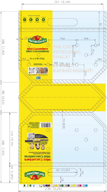
Structural Concept & Inspiration
The structural approach focused on a resealable zipper bag format that protects fresh produce while improving consumer usability. The pouch supports easy handling, repeat opening/closing, and efficient merchandising. The layout was designed to remain legible on flexible film and to work within real packaging constraints such as zipper/header clearances, seal areas, and variable bag curvature. The system also scales cleanly across multiple SKUs, allowing new varieties to plug into the same structure without redesigning the full package.


Graphic Design
As the graphic and packaging designer on the project, I developed the visual system and production-ready artwork for the resealable zipper bags. This included:
-
A bold, brand-consistent front panel that highlights freshness and snack convenience
-
Clear hierarchy for product name, variety (peppers/cucumbers), and key callouts
-
Print-ready files prepared with safe zones, zipper/header clearances, and production constraints in mind
-
A scalable layout that adapts across multiple SKUs while maintaining consistency
-
Final labeling aligned to real retail and e-commerce requirements
The result is a zipper-bag system that balances strong shelf impact, fast shopper readability, and functional packaging performance for fresh produce.


Project Outcomes
The final resealable zipper bags improved shelf presence and made the products easier to shop at a glance. The updated front-of-pack hierarchy strengthened variety recognition (peppers vs. cucumbers), supported freshness cues, and translated cleanly to both retail displays and e-commerce imagery.
My Role
I led the packaging design development end to end, combining brand integration, production-ready artwork, and final file preparation for flexible packaging. This included building a scalable layout system for multiple SKUs, preparing print-ready files with safe zones and zipper/header clearances, and ensuring consistency across variants.
Impact & Learnings
This project reinforced the importance of designing for real-world flexible packaging constraints while maintaining strong brand storytelling. It strengthened my ability to create scalable systems across SKUs, keep typography legible on flexible film, and deliver artwork that moves smoothly from design to production for both retail and digital channels.